%20(1).webp)
Understanding how to evaluate a website's design effectively is an essential skill for marketers today. With many design elements and user experience considerations, understanding how to do so is crucial.
The distinction between a successful website and an underperforming one often hinges on the ability to evaluate design comprehensively. Stay calm; this guide gives you insights into how to evaluate a website design.
Table of contents:
Understanding the Importance of Website Design Evaluation
How to Evaluate a Website Design
1. Understanding Your Website's Purpose
2. Conducting a First Glance Test
3. Telling a Compelling Visual Story
4. Ensuring Seamless Navigation
6. Prioritizing Mobile-First Design
7. Content Quality and Accessibility
Understanding the Importance of Website Design Evaluation
Website design evaluation is a pivotal task that can significantly impact your marketing efforts. It transcends mere aesthetics, encompassing the ability to assess how well your website fulfills its intended purpose, engages visitors, and ultimately drives business outcomes.
For both marketers and non-designers, mastering web design evaluation, including critical aspects such as the website's purpose, visual elements, website color pattern, and more, is essential for optimizing website conversion. This process may initially seem daunting, but focusing on key evaluation criteria makes it more manageable and impactful for achieving the desired outcomes in terms of website conversion.
How to Evaluate a Website Design
A well-crafted website looks good and quickly attracts visitors by providing relevant information. To delve deeper, let's explore some key aspects to consider when evaluating websites, along with website evaluation examples.
1. Understanding Your Website's Purpose
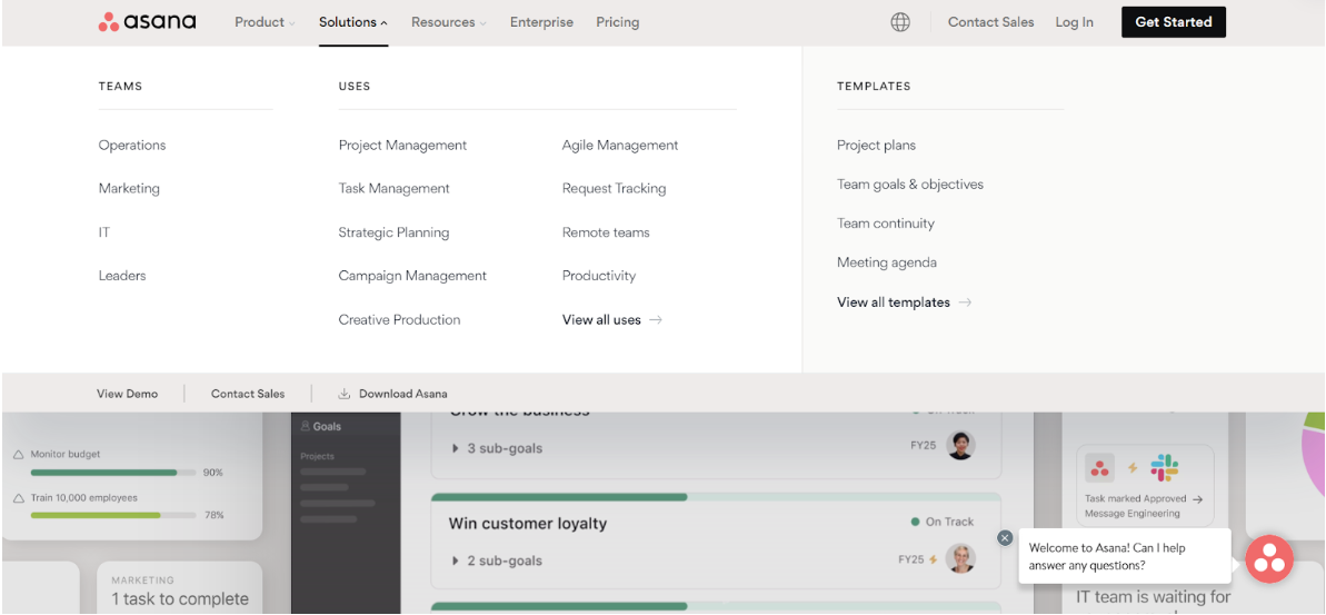
Before delving into other aspects of website assessment, it's essential to grasp your website's primary objective. Consider Asana as an example. Their website design clearly focuses on project management solutions, from navigation menus to content layouts. By staying true to their mission, they've crafted a user experience that effectively supports their business objectives.
Your website should convey a unique and clear message that aligns with your broader objectives and resonates instantly with visitors. Whether selling products, providing services, or delivering valuable information, the central message should be easily identifiable and harmonize with your target audience's needs.
2. Conducting a First Glance Test
The first glance test is integral to website evaluation. This technique involves assessing your homepage within the span of 5 seconds to determine if it effectively communicates its value proposition. Since users' attention spans average around 4 seconds, passing this initial assessment by delivering key messages promptly can significantly enhance visitor engagement and retention.
During this process, you must consider some crucial elements:
(i) Articulation of Value Proposition
Your website must articulate its unique selling point or value proposition immediately upon landing on your page. The message you share should be short but interesting enough to catch visitors' attention right away. If visitors need help figuring out what your website is about, they might leave to find information elsewhere.
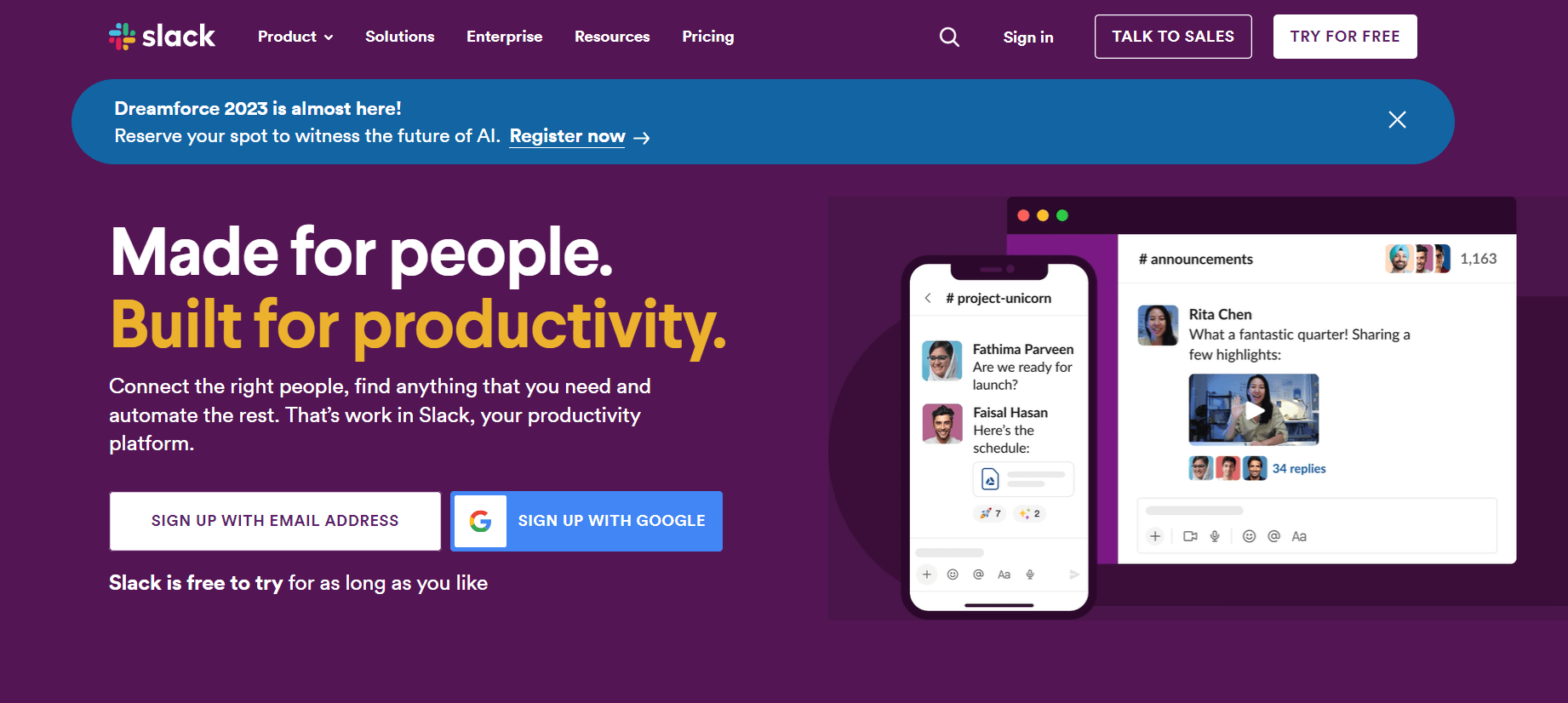
An excellent example would be Slack's homepage which states, "Made for people. Built for productivity." This simple sentence tells you right away what Slack does – it's a place for productivity-built-related things.
Access the Free Homepage CRO Checklist, which includes 14 practical tasks and 25 real-life examples designed to optimize your website's homepage for better performance.
(ii) Consistent Visual Elements
Having consistent visual elements on your webpage is crucial to grab users' attention in those short moments they spend there. This involves using images, color schemes, and typography that work together to create a certain impression of your brand. When these visual components are well-coordinated, they help guide visitors' focus to key information and calls-to-action (CTAs) on your page.
(iii) User-friendly Layout Design
The overall design structure plays into how swiftly users can absorb information from viewing web pages upon their first visit. A clean, organized format aids better comprehension than cluttered pages overloaded with content or ads.
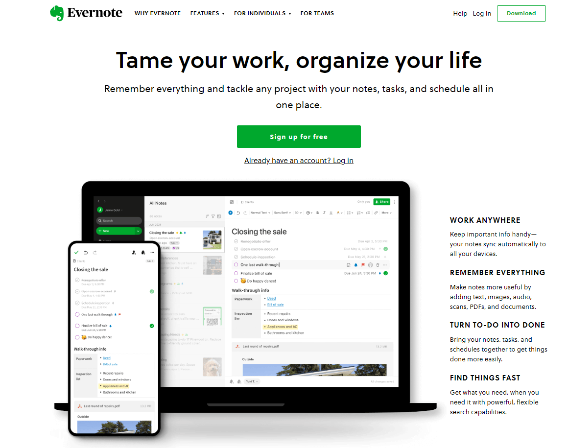
We can observe this principle with websites like Evernote, well-known for its minimalist design strategy. Such an approach ensures that the content is easy to read, allowing users to grasp the information, even upon their initial glance, quickly.
To succeed in the critical 'first-glance test,' the key lies in presenting captivating content and guaranteeing immediate usability. All of this needs to happen within those crucial five seconds.
Keep in mind that every visitor to your website presents a potential opportunity. In these fleeting moments, your goal is to capture their interest, making them want more.
For an in-depth guide on designing a website homepage specifically tailored for SaaS conversions, check out my video.
3. Telling a Compelling Visual Story
Web design goes beyond just making things look nice. It's about telling your brand's story in a way that grabs people's attention and guides them through information logically.
Using low-quality images or content can harm your brand's reputation and make users doubt your credibility. This is why using top-notch visuals is crucial – they reflect your brand and communicate your message clearly.
(i) Optimizing Screen Real Estate
The top portion of your website, known as the "above the fold" section, occupies most of the visible screen space. This prime area is where your value proposition is showcased to visitors when they arrive on your site. It's crucial that this section effectively communicates what you're offering, using attention-grabbing headlines, clear sub-headlines, concise bullet points, or engaging infographics.
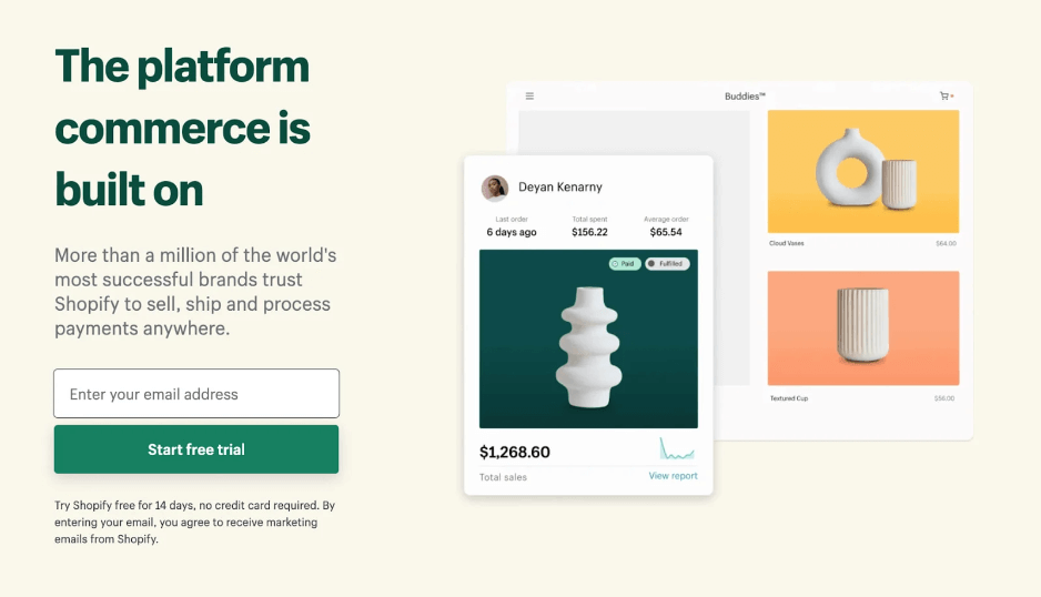
Let’s check this example from Shopify, which employs images effectively in its above-the-fold content to entice readers to delve further. Shopify offers a platform for individuals to kickstart their own e-commerce ventures. The top portion of the page utilizes product images from Shopify's inventory, showcasing the practical application of the software.
The main page features visually appealing images that leave a lasting impact on users. Despite the limited text, the tagline is impactful and motivates visitors to click the prominent green call-to-action button, encouraging them to initiate a trial experience.
(ii) Understanding the Role of Color in Web Design
The colors you choose for your website don't just affect how it looks; they also impact how users feel and how your brand is perceived. Picking the right color scheme can evoke emotions like calmness with blue tones or energy with red hues. It's important to consider accessibility, too, ensuring the colors you choose don't make it difficult for people with visual impairments to read or understand the content.
4. Ensuring Seamless Navigation
Easy navigation is pivotal for retaining user interest and engagement. Strategic design decisions that prioritize seamless browsing experiences are imperative for user satisfaction.
(i) The Role of Site Maps in Navigation
A well-crafted site map is an essential navigational tool by offering users an overview of all available content on your platform. More than just enhancing user experience, it also contributes positively towards search engine optimization (SEO) efforts by aiding search engines like Google or Bing to index your website more effectively.
- An up-to-date sitemap reduces frustration among visitors who need help finding what they're looking for quickly enough, thus reducing bounce rates.
- Sitemaps provide context about how various pieces fit together within the larger structure of your site.
- Your SEO strategy benefits from comprehensive sitemaps, which help distribute link equity across different sections while providing clear pathways for crawlers.
(ii) Innovative Navigation Elements
Apart from conventional menus, inventive navigation elements such as breadcrumbs, compelling calls to action, and strategically placed footer links guide users seamlessly throughout your website.
By thoughtfully implementing these strategies, you can enhance user satisfaction, encourage prolonged engagement, and contribute to the overall success of your online platform.
5. Leveraging Tracking Tools
There are several tools available that aid in monitoring visitor interactions on your site. One such tool widely used by many businesses is Google Analytics. This platform provides comprehensive statistics about traffic sources, conversion rates, sales figures, and more.
Besides Google Analytics, there's another powerful resource called Crazy Egg, which offers heatmaps showing where visitors click most often or scroll less frequently - giving deeper insight into interaction patterns across web pages.
Suggested Read: Best Heatmap Software Tools for Websites and Landing Pages
6. Prioritizing Mobile-First Design
Mobile devices drive significant web traffic, making mobile-first design essential. Prioritizing mobile-friendly layouts and functionality ensures a seamless experience across devices.
A report by Statista indicates that over half of global web traffic now originates from mobile devices, showing no signs of slowing down. Neglecting this audience could result in lost opportunities and potential revenue shortfalls.
7. Content Quality and Accessibility
Compelling content is the backbone of any successful website. Content should be engaging and accessible to diverse users, including those with disabilities. Here are some more factors to consider in evaluating website content:
- Relevance: Is the content aligned with the website's purpose and target audience? Is it up to date?
- Readability: Is the content easy to read and understand? Short paragraphs, bullet points, and headings can enhance readability.
- Accessibility: Does the website follow accessibility guidelines, such as providing alternative text for images and ensuring proper HTML markup for screen readers?
For more insights into content marketing best practices and how to master the art of engaging and accessible content, take a deep dive into this comprehensive blog post: Content Marketing. Best Practices
FAQ’s
1. Why is website design evaluation important for marketers?
Website design evaluation is crucial for marketers as it directly impacts user engagement, conversion rates, and overall business outcomes. It helps ensure that the website effectively communicates its value proposition, engages visitors, and aligns with marketing objectives.
2. What factors influence the cost of website evaluation?
The cost of website evaluation can vary depending on factors such as the size and complexity of the website, the depth of analysis required, the expertise of the evaluators, and any additional services or tools used in the evaluation process.
3. What are some additional resources for mastering website design evaluation?
Explore online resources, courses, and forums dedicated to website design, user experience (UX) design, and digital marketing to enhance further your skills and knowledge in evaluating and optimizing website design for maximum effectiveness.
Conclusion
Evaluating website design encompasses more than aesthetics; it's about aligning design elements with your objectives, passing the first-glance test, and providing seamless navigation. A compelling visual story, mobile-first design, and professional use of design elements amplify user engagement.
Mastering these strategies in evaluating website design will equip you to create impactful online platforms that look stunning and deliver tangible results. As you embark on this journey, remember that user experience remains at the core of effective web design.
Also Check:
Website Audit Cost Reduction Tips: Unlock Savings
B2B Website Metrics to Track for Higher Conversions
Heatmap for UX: Your Complete Guide for Better Conversions
Heat Map Analysis Guide to Better Conversions
Top B2B Website KPIs to Measure
