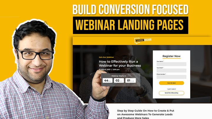
A “webinar landing page” serves as the primary touchpoint between a brand’s webinar campaign and potential attendees, with the goal of converting visitors into registrants. It plays an essential role in marketing a webinar by providing insights and an easy way for the target audience to sign up.
While a landing page does bring in high-potential traction, it does not guarantee registration. Hence, it becomes crucial for marketers to focus on the vital elements of the landing page of webinars to optimise it for a better registration rate.
In this blog, I will discuss the five elements you need to optimise your webinar landing page to get more signups.
Importance of Webinar Landing Page Optimization
A webinar landing page is your chance to grab the audience’s attention and get them excited about your event. It has a single goal: to entice visitors to provide their contact information and reserve a spot in your webinar.
Webinar landing page optimization helps you get more signups as it caters to audience pain points and addresses how the webinar can solve their problems. Landing page SEO is an integral part of developing a successful webinar strategy.
Most webinar platforms provide a registration page that fails to impress, although it serves the purpose. You need a custom landing page designed using your brand colours and style to stand out from the competition.
7 Elements to Consider While Building a Webinar Landing Page
Here are seven key elements to consider when building an evergreen webinar landing page, along with some examples of webinar landing pages that effectively utilise these elements:
1. Headline
The first thing you need to get right is the headline.
The headline is the most crucial element on the landing page; it will hook the visitor to stay on the page, learn about your webinar content and encourage them to sign up.
I always recommend using the benefit of the webinar content in the main effective headline vs having a feature or, worse, having a vague headline. Although benefits and features might sound very similar, there is a massive difference.
Here is a simple example:
A toy could have a specific feature – Batteries Included.
But the benefit is ….that it’s ready to use.
And if you were writing a sales message around this benefit, you could have something like:
Ready to use, straight out of the box with no hassle and a happy kid on their birthday.
To summarise:
A feature means – what it is
and a benefit is – what it does
To help you write your headlines, I have put together a website with many webinar landing page examples from different industries for your inspiration.
Check: Free Unbounce Webinar Template and Swipe Files
2. What’s Covered
The following essential element includes a list of bullet items that define what will get covered in the webinar and what your participants will learn.
Here is an example of a dedicated landing page we designed for one of our clients 10x Travel.
On this page, you will notice a big, bold headline that immediately talks about the benefits of why somebody should care to join the webinar. And under Max, the presenter, we have a list of items covered in the webinar topic that is easy to read and understand.
Overall the page is very simple to follow, and every landing page element aligns with a single campaign goal to get more signups.

3. Date / Time
If you are running a scheduled webinar, make sure to specify the correct date and time with event details. If you plan to target specific regions, show times in different time zones so participants can quickly check their availability in their local time zone.
Bonus tip: You can also add iCal or ICS files to allow participants to add the event to their Outlook or Apple calendar.
4. Host and Guest info
It is essential to showcase the host and guest speaker’s info on your landing page as those are the people your audience will interact with most. So, it would be best to give people a reason to listen to these hosts by telling them about their job title, experience, industry expertise, etc.
Things that you can include in your host bio:
- A headshot image of good quality
- Job Title
- Years of industry experience
- Areas of expertise
- Awards and recognitions
I love this example from Wordstream. On this page, they have mentioned the experience and expertise of their webinar hosts.

5. Social Proof
Although optional, you can add social proof of previous customers or leads who benefitted from the webinar. It helps customers make decisions and makes them feel confident about their choice. You can use testimonials, company badges, or reviews as your social proof.
For example, you can embed direct tweets on your page to build trust and authenticity.
💡 **Want help implementing this?**
Download Your Landing Page Testimonial Examples – a free resource packed with real examples of how to showcase testimonials on your landing page or website.
6. Form Fields
When creating a webinar registration form, it’s important to consider which fields you should capture and how much info you should ask for based on the type of content.
It is a tricky question; if you target a cold audience, I would recommend a simple registration form with just name and email. But if you are marketing to an existing list, you can use the webinar registration form as an opportunity for lead enrichment. E.g., you can capture the company name and size.
Remember, the number of leads significantly drops if you have more than 4 form fields, so using a single form field for email is a good strategy to increase webinar registration rates.
7. Conversion Elements
To maximise your chances, I would recommend three conversion drivers
(i) Urgency
You can add a countdown timer to show time is running out.
(ii) Scarcity
Add a limit to the number of participants. That way, you drive visitors to take immediate action.
(iii) Call to action button
a. Using both these principles, you can use the button text to show
- Limited seats
- Take action now
- Be part of an exclusive training
b. Since we are talking about the CTA button, make sure to use a bright contrasting colour for your signup form button to grab visitors’ attention. The CTA button should stand out from the rest of the page.
Bonus
The mighty thank you page.
Thank you pages are great and possibly undersold. Every visitor who goes through your webinar visits the thank you page- that’s a view rate of 100%. It pains me to see people not using the thank you page to its full potential.
I strongly recommend adding a video. And you can have a 2-3 min video that covers two things:
- Thank visitors who signed up
- Re-affirm why they should join the webinar and why it would be amazing
FAQs About Webinar Landing Page
What is a webinar landing page?
A webinar landing page is a dedicated web page designed to promote an upcoming webinar and encourage visitors to register. Its sole purpose is to convert traffic into signups.
Why is optimizing a webinar landing page important?
Optimizing your webinar landing page improves your chances of converting visitors into registrants. It helps communicate the value of your webinar, builds trust, and removes friction from the signup process.
How long should a webinar landing page be?
Keep it concise. Focus on the headline, key benefits, speaker info, and a clear call to action. Avoid unnecessary content that distracts from the signup goal.
What makes a headline effective for a webinar landing page?
An effective headline highlights the main benefit of attending the webinar. It should be clear, results-focused, and speak directly to the audience’s pain point or desire.
Should I use a pre-built webinar landing page or custom-design one?
While webinar platforms offer default pages, a custom landing page (using tools like Unbounce) allows full control over design, branding, and conversion-focused features—leading to better results.
How many form fields should I use?
Use the minimum number of fields possible—ideally just name and email. Only ask for more details if absolutely necessary, especially for cold traffic.
What kind of social proof should I include?
You can include testimonials, reviews, company logos, or embedded social media posts from past attendees to build trust and credibility.
How do I create urgency on a webinar landing page?
Use a countdown timer, mention limited seats, and include action-focused CTA text like “Reserve Your Spot Now” or “Only 50 Spots Left!”
Should I include the host’s bio and photo?
Yes. Adding speaker info builds trust and credibility. Include a headshot, job title, expertise, and any notable achievements.
What should I do with the thank you page?
Use it wisely! Add a short video to thank registrants, reaffirm the value of the webinar, and offer a calendar invite or further instructions to increase attendance rates.
Conclusion
Now you know all about webinar landing page optimization and are ready to turn your traffic into signups for your future webinars. I recommend using Unbounce to build your high-converting landing pages, but there is no reason you can’t use any other builder.
The first is a webinar landing page website to inspire your future designs and a webinar landing page template built in Unbounce, which you can easily edit to match your brand. The template also has a timer to drive urgency.
Access our valuable resources, featuring a webinar software comparison chart and an actionable checklist, to ensure your webinar success.
Also Check:
Landing Page vs Web Page: What’s The Difference?
13 Types of Landing Pages: How and When to Use Them
Beginner’s Guide To Landing Page A/B Testing Framework
Guide To Build An Automated Funnel Why And When To Use Landing Pages


